Harvard’s Ash Center
A multi-site design for multiple Harvard Kennedy School programs
The Challenge
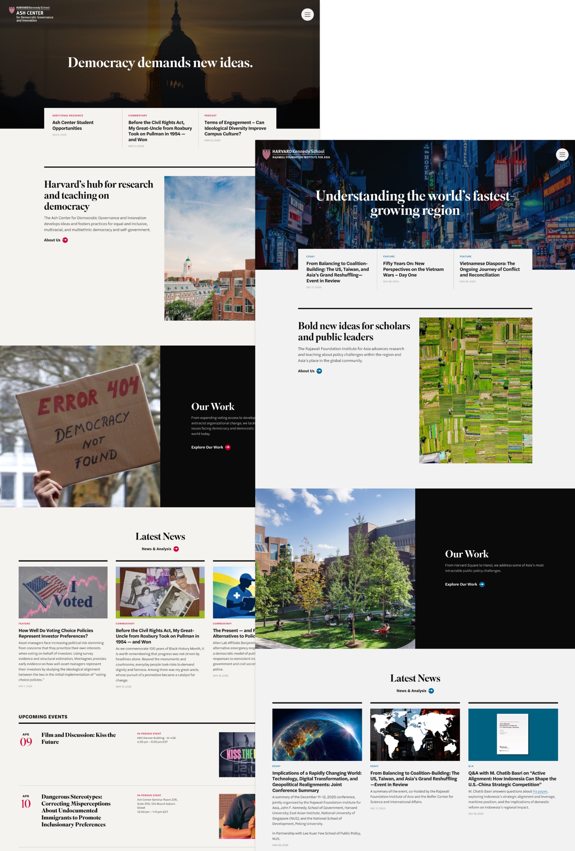
The Roy and Lila Ash Center for Democratic Governance and Innovation at Harvard Kennedy School convenes students, academics, practitioners, and policymakers from around the world to produce rigorous research and expert analysis on civic engagement, antiracism in governance, and tribal sovereignty. Their ten-year-old site had aged past its usefulness: the information architecture was organized around internal program teams rather than the Center’s actual work, making it increasingly hard for their key audiences—scholars, policymakers, and practitioners—to find what they needed.
The project had an added layer of complexity: one of the Ash Center’s flagship programs, the Rajawali Foundation Institute for Asia, had grown large enough to warrant its own dedicated website. The communications team needed both sites built, cross-promotion functionality between them, and flexible translation capabilities to serve a global audience—without doubling their content management burden.
The solution: two research-forward websites, a single content management system, and full translation capabilities.
My Role
I served as Art Director and UX Strategist, and I designed the selected visual design concept. I worked closely with the Lead Content Strategist to determine how the site’s content architecture, navigation, and user journeys were structured. I also led the art direction and visual design concept that defined the look and feel of both sites, and worked closely with the lead UI designer to bring the UX strategy, visual language, and interaction details into alignment so they told the same story.
UX Strategy
A card sorting exercise revealed that the old site’s organization made sense to Ash Center insiders but was opaque to everyone else. Content was structured around program teams—an internal lens—rather than around the work itself and the questions their audiences were actually asking.
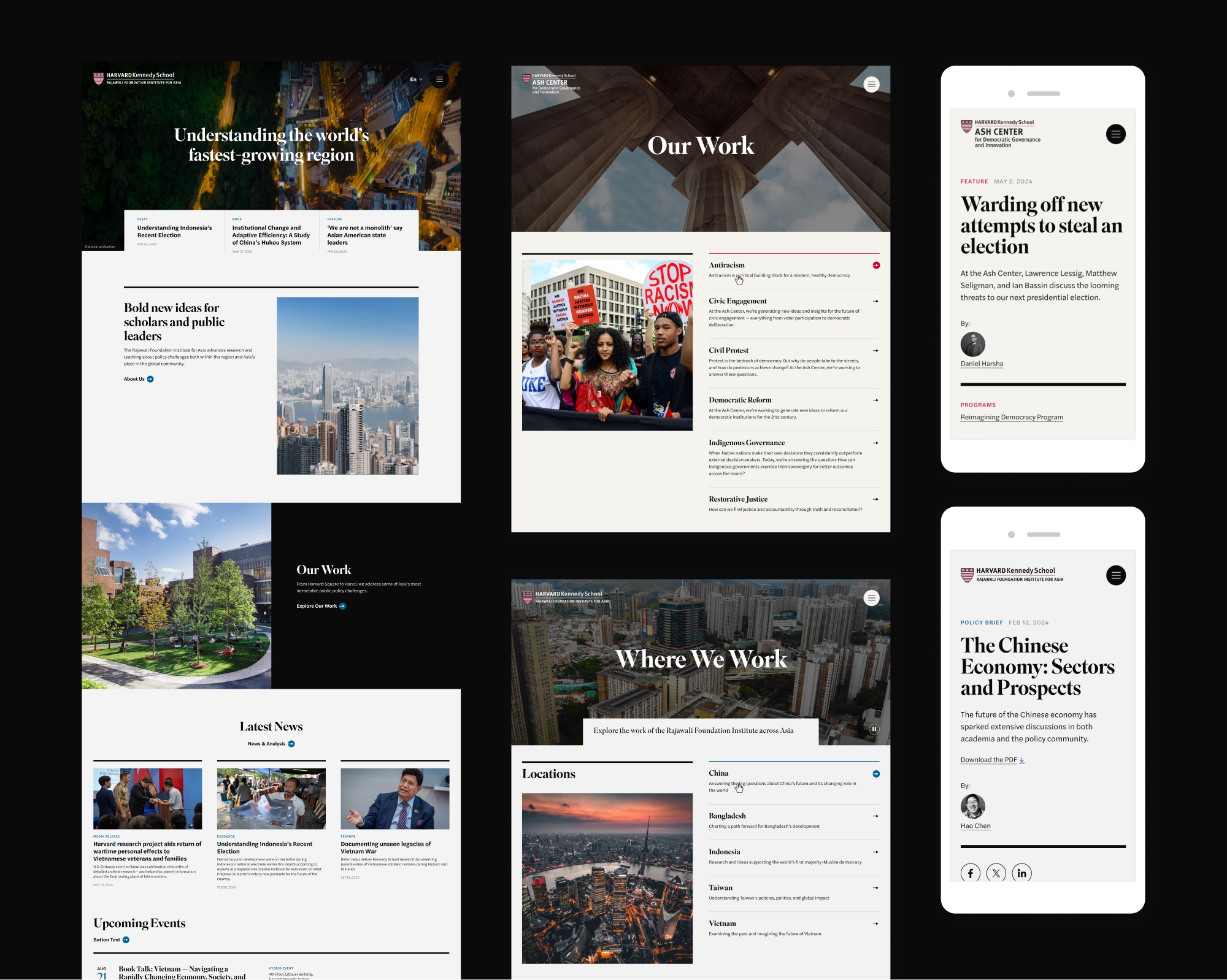
Our team reoriented the site around content and impact. We designed a content-rich homepage that put the Center’s research and analysis front and center, an easy-to-search content library that made years of accumulated work genuinely discoverable, and informative landing pages for each program that gave them visibility and context without requiring users to already know how the Center was organized internally.
Art Direction & Visual Design
I developed the selected visual design concept for both sites, focusing on an aesthetic that is research-forward and communicates the rigor and credibility of a Harvard institution while remaining warm, accessible, and content-first. The design needed to work across two distinct site identities (Ash Center and Rajawali Foundation) while maintaining the coherence of a shared design system and CMS.
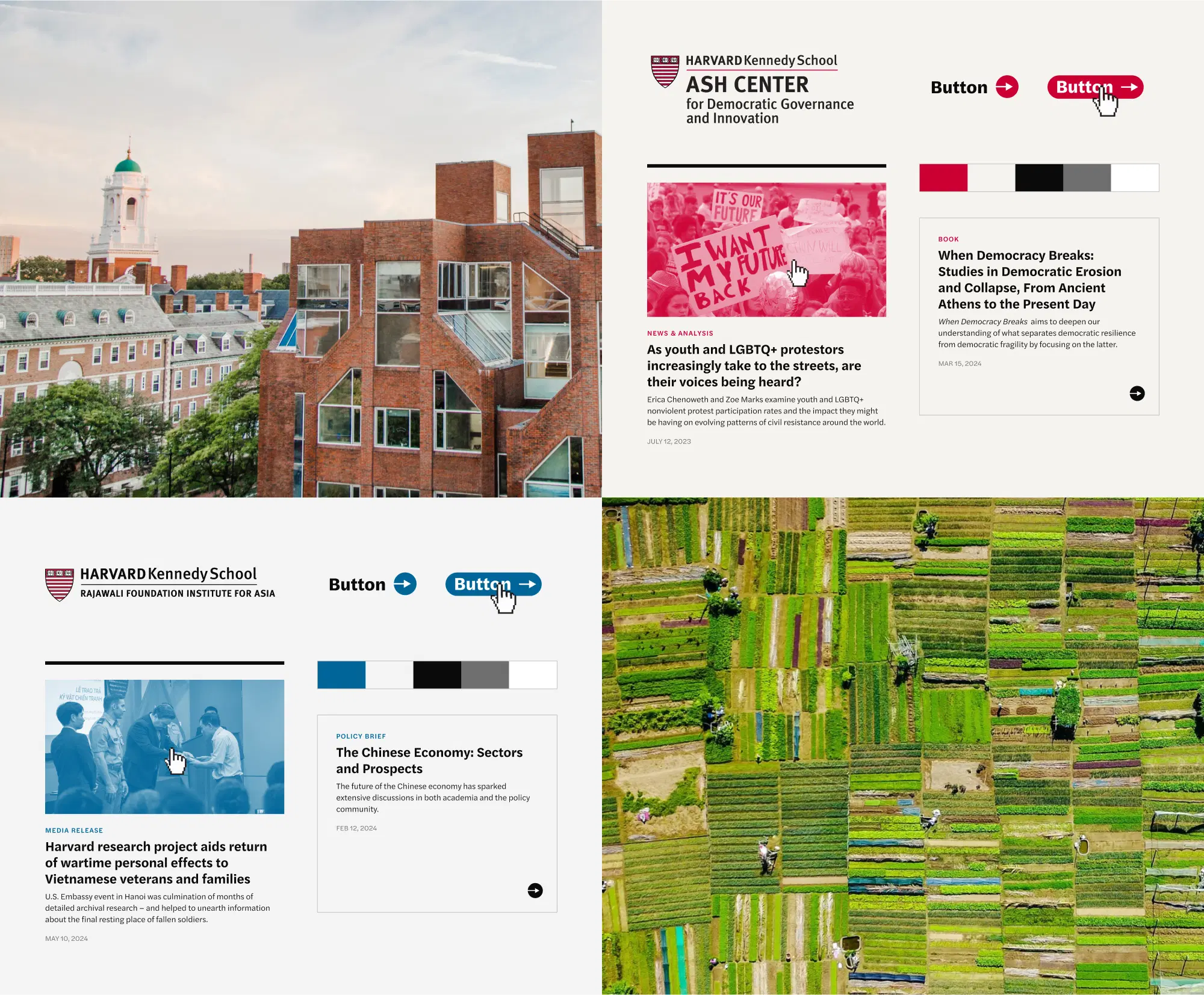
The design system also accommodated full translation capabilities including right-to-left languages and alternative character sets such as Chinese. Every layout and component decision had to be stress-tested against these constraints—ensuring the design held up across language contexts without requiring separate templates or manual adjustments. Cross-promoted content across both sites now feels native in either context, and the development team built a single publishing platform where admins author content once and check a box to publish it to either or both sites. The result eliminated the content duplication risk the communications team had been concerned about, and significantly reduced ongoing maintenance burden.
.jpg)
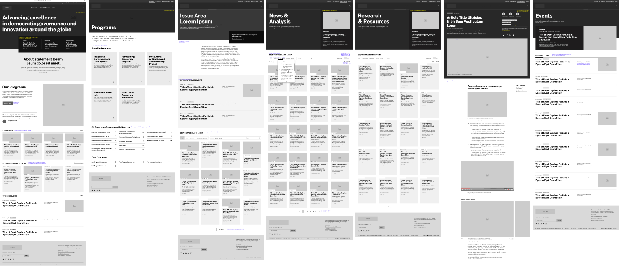
One significant UX challenge was the events architecture. The Ash Center and Rajawali Foundation host a wide range of events—from hourlong webinars to multi-day, multi-speaker conferences—and the old site handled these poorly. I art directed the design of a flexible event page template that scales elegantly from simple to complex: it beautifully markets a straightforward event by default, with optional components that expand seamlessly to accommodate conference-scale content needs without requiring a separate template or custom build.
The Outcome
The Ash Center’s redesign achieved full “Good” ratings across both mobile and desktop on Google’s Core Web Vitals—a rare distinction that reflects the site’s technical excellence and the performance-conscious design decisions built in from the start. Beyond the technical benchmarks, the site now gives the Center a platform that genuinely matches the ambition and reach of their research.
“From the start, the Teal team pushed us to think about how every decision we made would impact user experience. They were constantly problem-solving to meet our unique needs. The result is two amazing websites that exceeded our expectations. We regularly receive positive comments on not just the new design but how easy the websites are to use on the backend.”
–Sarah Grucza, Assistant Director of Communications, Ash Center at Harvard Kennedy School
Credits
Designed at Teal Media
Content Strategist: Melanie Starkey
UX/UI Designer: Morgan Foust
Development: Jeff O’Connell, Jason Narciso
Project Manager: Tiffany Wang