Center for Justice Innovation
A vibrant and dynamic website to showcase innovative work in community justice

The Challenge
The Center for Justice Innovation is a community justice organization working at the intersection of safety and racial justice—partnering with communities, courts, and the people most directly impacted by the justice system. When they came to Teal Media, their website had real structural problems: it couldn’t express the deep interconnectedness of their programs and focus areas, it buried timely content, and it failed to reflect their vibrant new brand identity. They were also carrying 2,500+ pieces of content on an outdated version of Drupal that needed to move.
The challenge was not just a redesign, but to also rethink how to structure their complex programs and make all of their content easy to access for practitioners, policymakers, community members, and advocates.
My Role
I led this project from strategy through visual design and QA. I facilitated discovery sessions to understand the organization’s goals and content challenges, ran learning sessions with the client team, and developed the content strategy and information architecture. I also produced the wireframes and carried all of that thinking directly into the visual design.
Discovery & Strategy
Early in the project I led working sessions with the Center’s and Teal’s teams to fully understand their programs, audiences, and content priorities. A key insight from discovery: the Center’s many programs each had their own identities, audiences, and staff, but lived under a shared parent brand. Any solution needed to honor both levels of that hierarchy. That tension shaped subsequent design decisions, from content architecture to the visual design system.
I led content strategy to reorganize how information was structured and surfaced—defining new post types, tagging taxonomies, and user journeys that would make it genuinely easier for different audiences to find what they needed. This included developing distinct wayfinding pathways for community members looking for local programs, and practitioners and policymakers seeking resources and research.
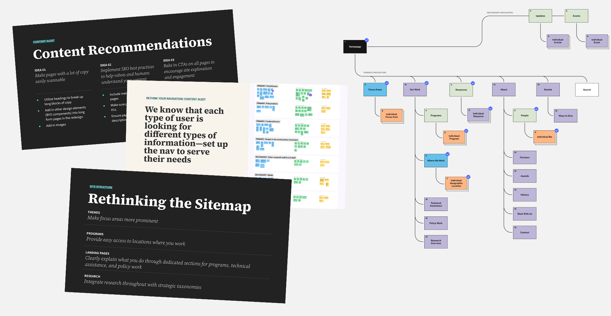
Wireframes & UX
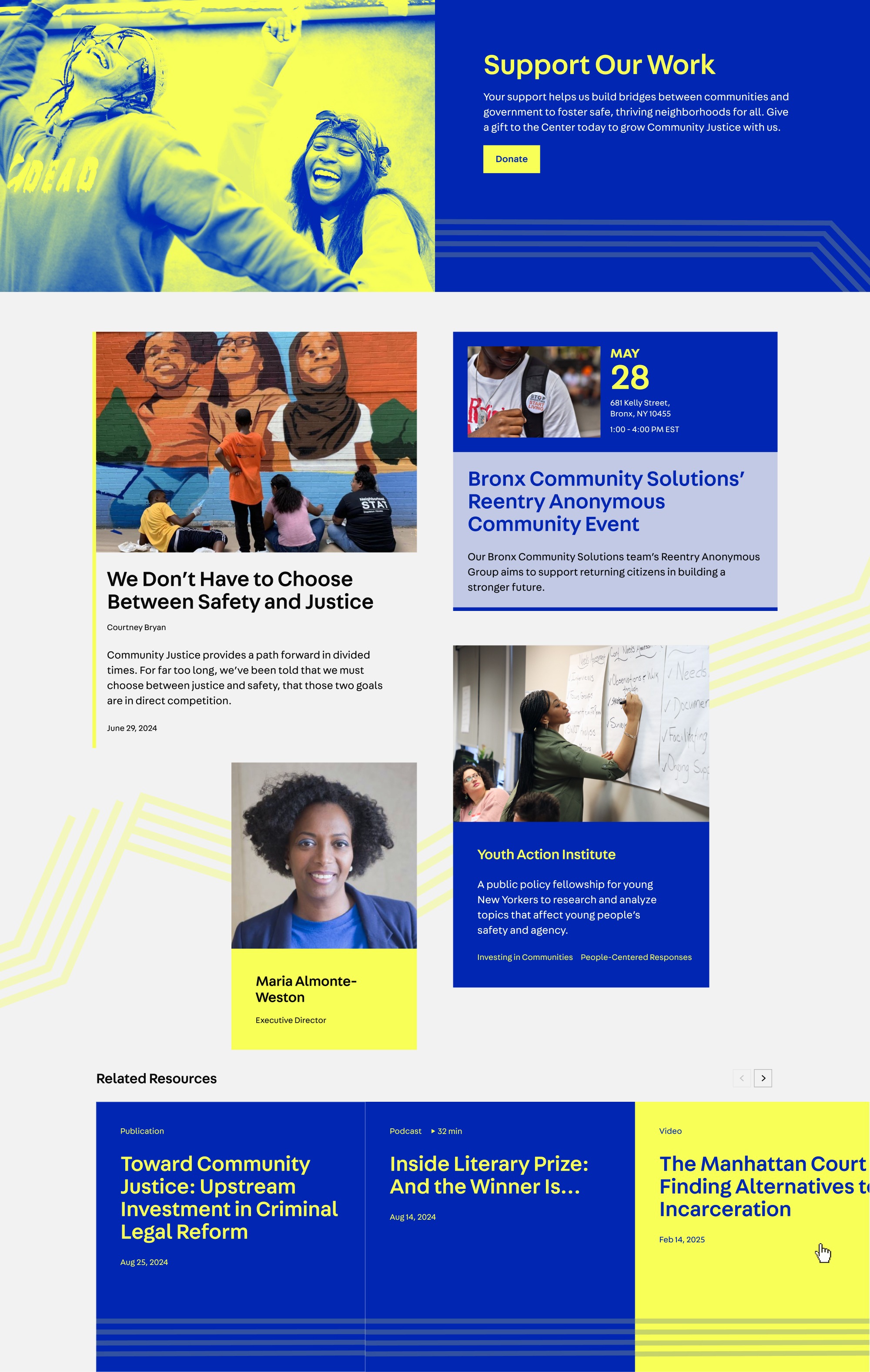
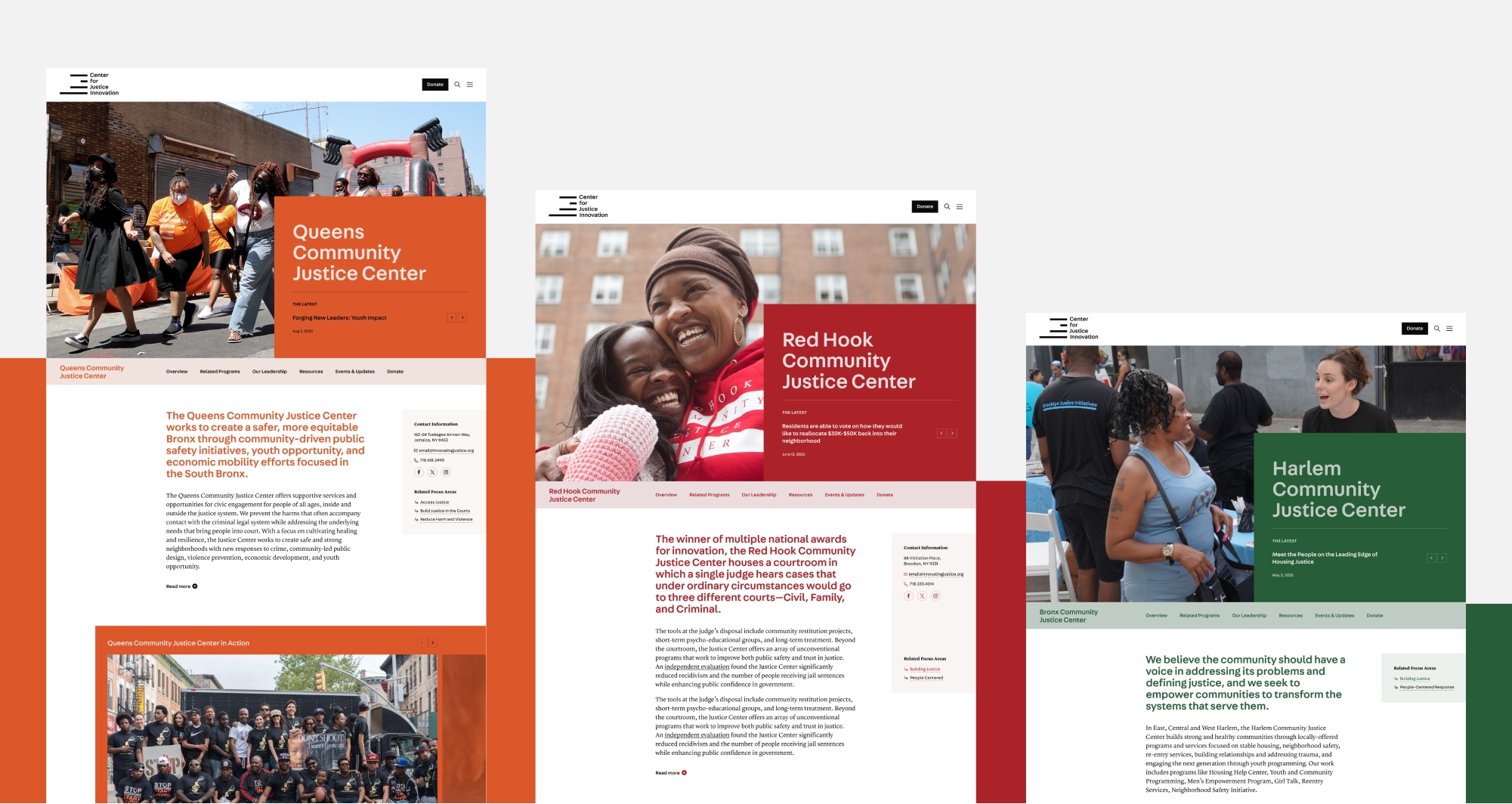
From the Website Plan’s strategic foundation I moved into wireframing—designing components and page structures that could flex across the Center’s many content types while maintaining clarity and hierarchy. A particular focus was the program discovery experience: I designed a dynamic program listing filterable by focus area and borough, as well as an interactive map experience that lets visitors search by location or zip code to find nearby programs. From there, users are guided into individually branded program pages with deeper information and clear next steps.
The resource pages are also very robust—allowing for optional takeaways, tables of content, featured authors, collection groupings, and a number of modular, flexible components for storytelling and easy scanning.
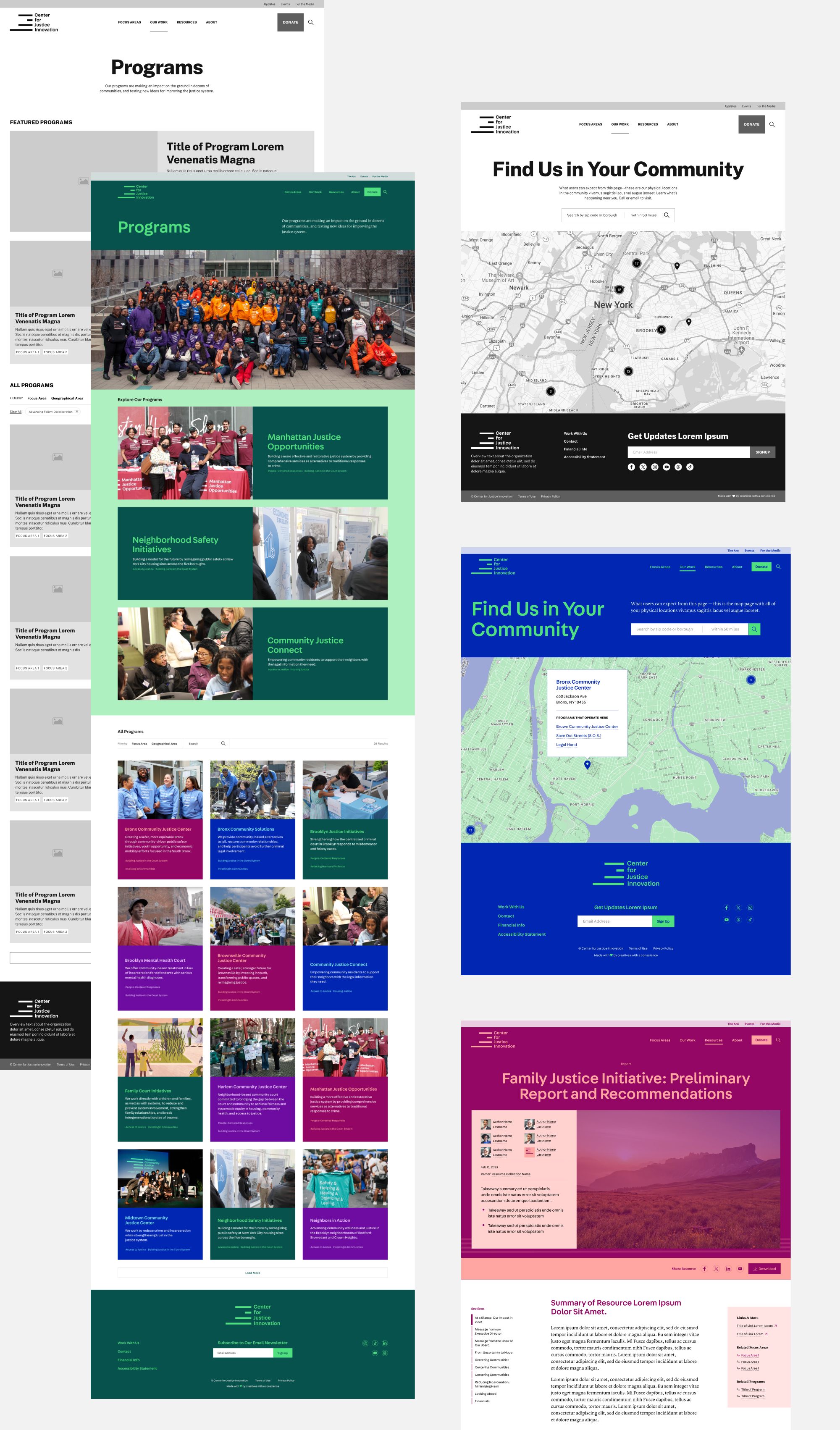
Design System & Visual Design
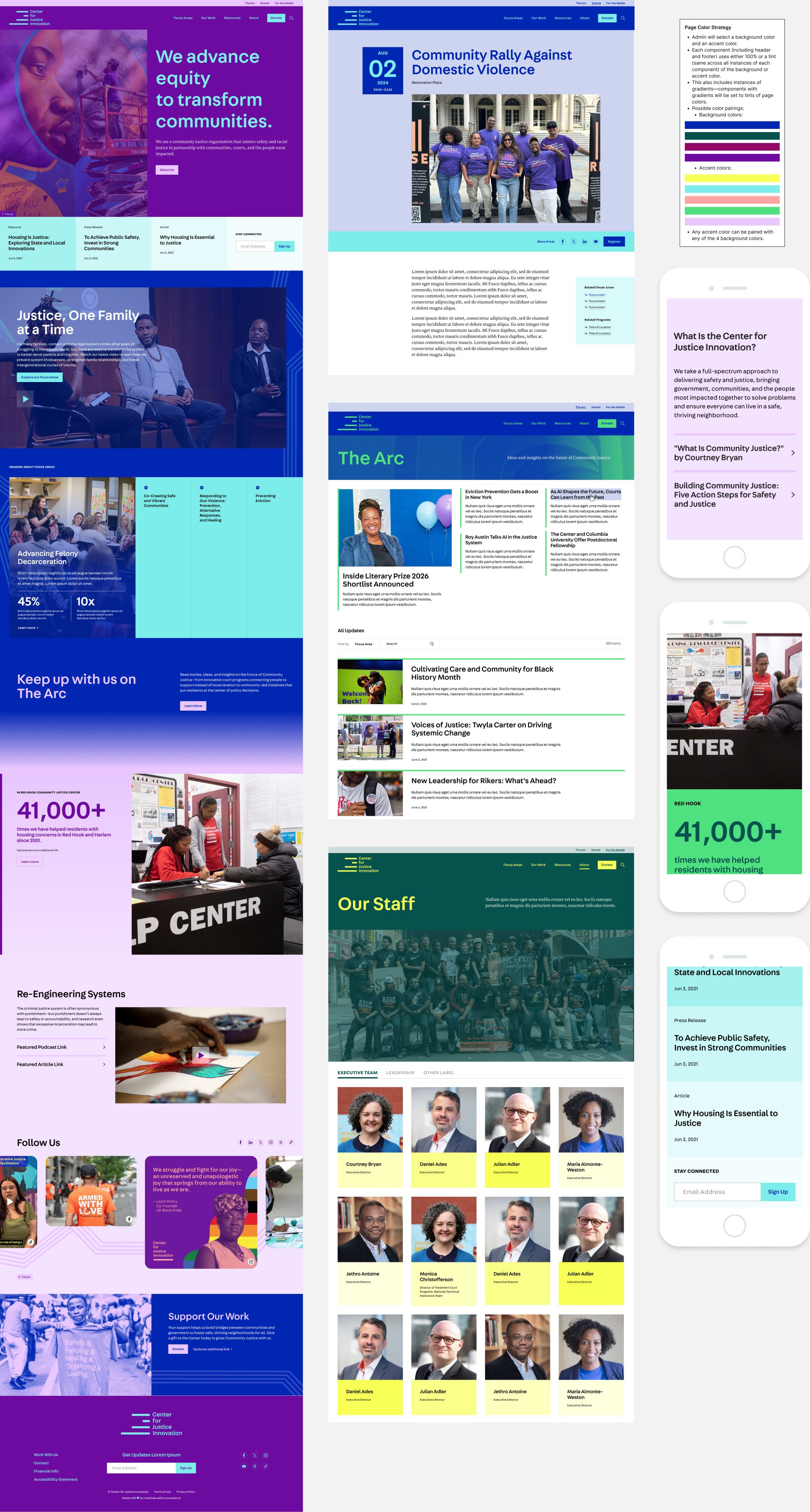
Translating the Center’s colorful new brand into a flexible, accessible digital system was one of the most technically interesting parts of this project. I built a color pairing system that assigns a background color and an accent color to each page of the site. Every component then draws from either a tint of the background or the accent—creating visual variety and brand expression while maintaining a coherent, systematic logic across hundreds of pages.
Because the site uses gradients and photo overlays, I carefully tested every color pairing against WCAG accessibility standards before the system was finalized. The goal was a system where any combination an admin could select would be guaranteed to be accessible—removing that burden from content staff entirely.
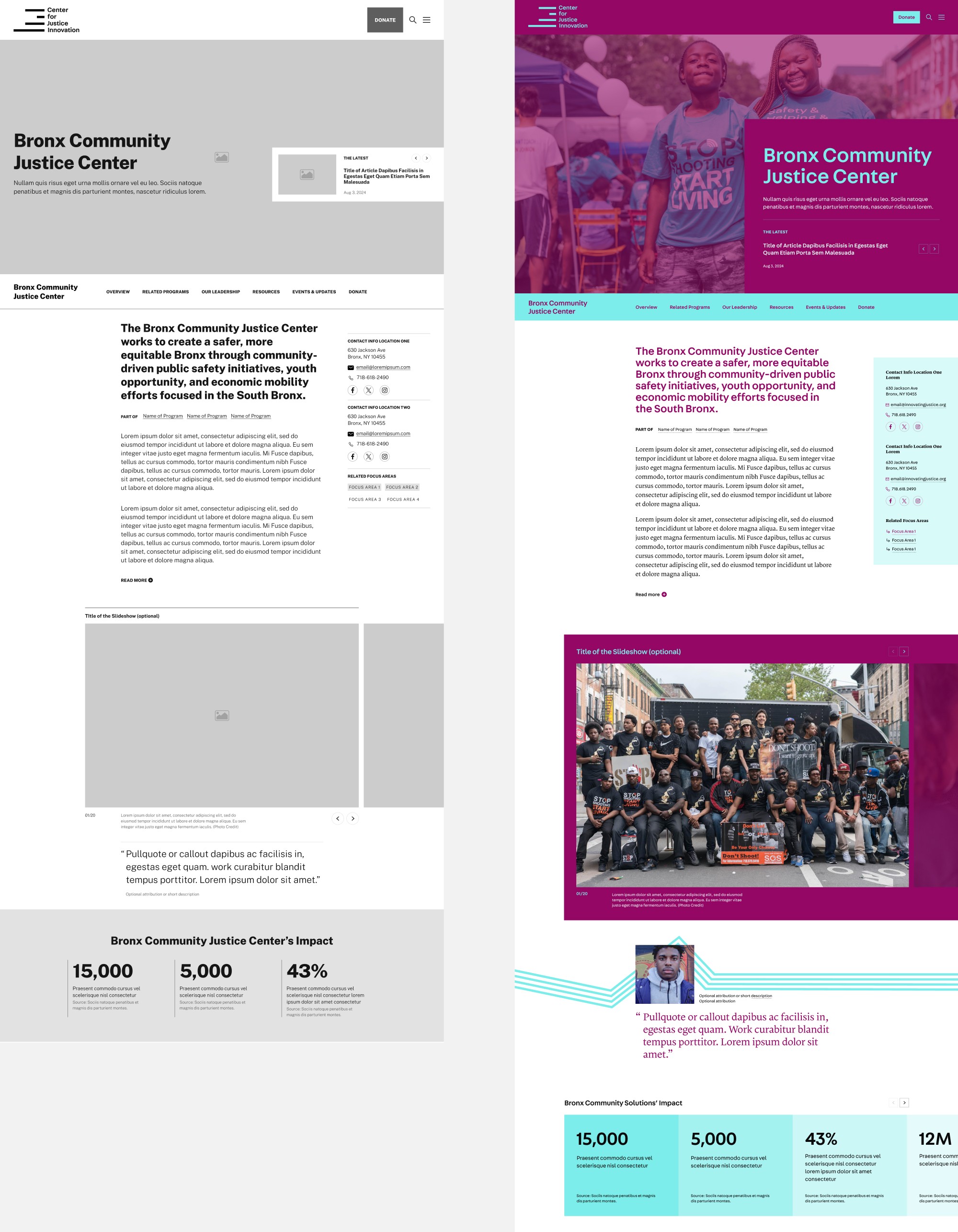
For the Center’s individual programs—many with their own distinct brand colors outside the brand’s parent palette—we designed custom color selection capabilities in the admin, paired with a built-in tool that automatically scans each page and switches elements to white or black if contrast thresholds aren’t met. Every program gets its own branded presence and accessibility is never an afterthought.
I also workshopped key pages and design system elements directly with the client throughout the process. This website was a true collaborative project that ensured alignment early and reduced late-stage revisions.
The Outcome
The site gives the Center a dynamic, future-proof platform that finally matches the ambition and energy of their work—one that can grow with them as their programs evolve. Practitioners, policymakers, and community members can now find trustworthy resources and connect with programs in their area with far less friction. And the Center’s staff has the tools to keep the site feeling current and on-brand now and into the future.
Credits
Designed at Teal Media
Front-end Development: Brandon Amey, Jessica Stevens
Back-end Development and Technical Lead: Austin Whipple
Back-end Development: Jackson Whelan
Project Manager: Kendall Gilfillan
Visual Design Support: Katie Corbett